Icons & Branding
Icons and pictograms are powerful tools for structuring content. By visually breaking down complex information, they guide the reader’s attention and highlight key points, making the content more accessible and engaging. As graphical elements they are particularily suited for presentations, posters and web content, but also text documents such as proposals and theses can benefit. Paired with a consistent color scheme for text elements and figures, they not only enhance communication clarity but also lend a cohesive and professional appearance to your work, ensuring that your message is both impactful and memorable.
Icons & Pictograms
Examples of icon sets designed for different contexts
![]()
![]()
![]()
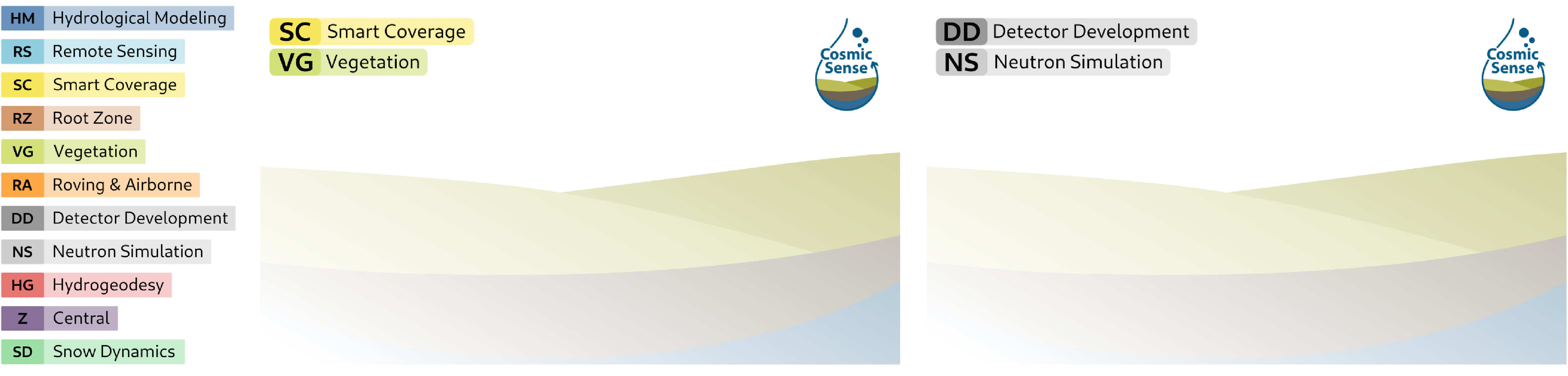
Branding and color coding
Using consistent colors, fonts, and design elements across all publications is a powerful way to establish recognizability, present a professional appearance, and build a cohesive project or organizational brand. This can be achieved through carefully developed guidelines, color palettes, and templates, which ensure uniformity and clarity.
Color-coding in publications and documents facilitates the categorization and semantic structuring of content, making it easier to convey meaning and relationships. Additionally, it provides clear orientation for readers, enabling them to navigate and understand complex information more efficiently.
For instance, I developed a color code for a project that was consistently applied across various communication formats. In the project proposals, the color scheme was used to highlight sub-project contributions and interactions in both text and figures. During the defense, the same color code was featured prominently in presentation slides and as individual video call backgrounds for each consortium member, visually representing the sub-projects each person was involved in. This approach ensured clarity, consistency, and a unified visual identity throughout the project funding process and beyond.
Sub-project colors and example VC background